Density surface models case study (spotted dolphins)
Author: David L. Miller
1 Introduction
The analysis is based on a dataset of observations of pantropical dolphins in the Gulf of Mexico (shipped with Distance 6.0 and later). For convenience the data are bundled in an R-friendly format, although all of the code necessary for creating the data from the Distance project files is available on github. The OBIS-SEAMAP page for the data may be found at the SEFSC GoMex Oceanic 1996 survey page.
The intention here is to highlight the features of the dsm package, rather than perform a full analysis of the data. For that reason, some important steps are not fully explored. Some familiarity with density surface modelling is assumed.
This document is an abbreviated version of a more thorough document produced an appendix to Miller et al. (2013). That more thorough document can be found at github.com/dill/mexico-data.
This document is structured as follows: sections 1-3 deal with the data setup (including plotting considerations), section 4 begins with exploratory analysis and 5-6 consist of fitting and assessing models.
2 Preamble
To run this vignette, you’ll need to install a few R packages. This can be done via the following call to install.packages:
install.packages(c("dsm", "Distance", "knitr", "captioner", "ggplot2", "rgdal",
                   "maptools", "plyr", "tweedie"))
Before we start, we load the dsm package (and its dependencies) and set some options:
library(dsm)Loading required package: mgcv
Loading required package: nlme
This is mgcv 1.8-7. For overview type 'help("mgcv-package")'.
Loading required package: mrds
This is mrds 2.1.14
Built: R 3.2.1; ; 2015-07-30 07:49:18 UTC; windows
This is dsm 2.2.10
Built: R 3.2.1; ; 2015-09-04 10:07:01 UTC; windowslibrary(ggplot2)
# plotting options
gg.opts <- theme(panel.grid.major=element_blank(),
panel.grid.minor=element_blank(),
panel.background=element_blank())
# make the results reproducible
set.seed(11123)3 The data
3.1 Observation and segment data
All of the data for this analysis has been nicely pre-formatted and is shipped with dsm. Loading that data, we can see that we have four data frames, the first few lines of each are shown:
data(mexdolphins)
attach(mexdolphins)
segdata holds the segment data: the transects have been “chopped” into segments.
kable(segdata[1:3, ], digits=2) | longitude | latitude | x | y | Effort | Transect.Label | Sample.Label | depth |
|---|---|---|---|---|---|---|---|
| -86.93 | 29.94 | 836105.9 | -1011416 | 13800 | 19960417 | 19960417-1 | 135.0 |
| -86.83 | 29.84 | 846012.9 | -1021407 | 14000 | 19960417 | 19960417-2 | 147.7 |
| -86.74 | 29.75 | 855022.6 | -1029785 | 14000 | 19960417 | 19960417-3 | 152.1 |
distdata holds the distance sampling data that will be used to fit the detection function.
kable(distdata[1:3, ], digits=2)| object | size | distance | Effort | detected | beaufort | latitude | longitude | x | y | |
|---|---|---|---|---|---|---|---|---|---|---|
| 45 | 45 | 21 | 3296.64 | 36300 | 1 | 4 | 27.73 | -86.00 | 948000.1 | -1236192 |
| 61 | 61 | 150 | 929.19 | 17800 | 1 | 4 | 26.00 | -87.63 | 812161.7 | -1436899 |
| 63 | 63 | 125 | 6051.00 | 21000 | 1 | 2 | 26.01 | -87.95 | 780969.5 | -1438985 |
obsdata links the distance data to the segments.
kable(obsdata[1:3, ], digits=2)| object | Sample.Label | size | distance | Effort | |
|---|---|---|---|---|---|
| 45 | 45 | 19960421-9 | 21 | 3296.64 | 36300 |
| 61 | 61 | 19960423-7 | 150 | 929.19 | 17800 |
| 63 | 63 | 19960423-9 | 125 | 6051.00 | 21000 |
preddata holds the prediction grid (which includes all the necessary covariates).
kable(preddata[1:3, ], digits=2)| latitude | longitude | x | y | depth | area | |
|---|---|---|---|---|---|---|
| 0 | 30.08 | -87.58 | 774402.9 | -1002759.2 | 35 | 271236913 |
| 1 | 30.08 | -87.42 | 789688.6 | -1001264.5 | 30 | 271236913 |
| 2 | 30.08 | -87.25 | 804971.3 | -999740.6 | 27 | 271236913 |
Typically (i.e. for other datasets) it will be necessary divide the transects into segments, and allocate observations to the correct segments using a GIS or other similar package1, before starting an analysis using dsm.
3.2 Shapefiles and converting units
Often data in a spatial analysis comes from many different sources. It is important to ensure that the measurements to be used in the analysis are in compatible units, otherwise the resulting estimates will be incorrect or hard to interpret. Having all of our measurements in SI units from the outset removes the need for conversion later, making life much easier.
The data are already in the appropriate units (Northings and Eastings: kilometres from a centroid, projected using the North American Lambert Conformal Conic projection).
There is extensive literature about when particular projections of latitude and longitude are appropriate and we highly recommend the reader review this for their particular study area; Bivand et al (2013) is a good starting point. The other data frames have already had their measurements appropriately converted. By convention the directions are named x and y.
Using latitude and longitude when performing spatial smoothing can be problematic when certain smoother bases are used. In particular when bivariate isotropic bases are used the non-isotropic nature of latitude and longitude is inconsistent (moving one degree in one direction is not the same as moving one degree in the other).
We give an example of projecting the polygon that defines the survey area (which as simply been read into R using readShapeSpatial from a shapefile produced by GIS).
library(rgdal, quietly = TRUE)## rgdal: version: 1.0-6, (SVN revision 555)
## Geospatial Data Abstraction Library extensions to R successfully loaded
## Loaded GDAL runtime: GDAL 1.11.2, released 2015/02/10
## Path to GDAL shared files: C:/Users/eric/Documents/R/win-library/rgdal/gdal
## GDAL does not use iconv for recoding strings.
## Loaded PROJ.4 runtime: Rel. 4.9.1, 04 March 2015, [PJ_VERSION: 491]
## Path to PROJ.4 shared files: C:/Users/eric/Documents/R/win-library/rgdal/proj
## Linking to sp version: 1.1-1library(maptools)## Checking rgeos availability: TRUE# tell R that the survey.area object is currently in lat/long
proj4string(survey.area) <- CRS("+proj=longlat +datum=WGS84")
# proj 4 string
# using http://spatialreference.org/ref/esri/north-america-lambert-conformal-conic/
lcc_proj4 <- CRS("+proj=lcc +lat_1=20 +lat_2=60 +lat_0=40 +lon_0=-96 +x_0=0 +y_0=0 +ellps=GRS80 +datum=NAD83 +units=m +no_defs ")
# project using LCC
survey.area <- spTransform(survey.area, CRSobj=lcc_proj4)
# simplify the object
survey.area <- data.frame(survey.area@polygons[[1]]@Polygons[[1]]@coords)
names(survey.area) <- c("x", "y")The below code generates Figure 1, which shows the survey area with the transect lines overlaid (using data from segdata).
p <- qplot(data=survey.area, x=x, y=y, geom="polygon",fill=I("lightblue"),
ylab="y", xlab="x", alpha=I(0.7))
p <- p + coord_equal()
p <- p + geom_line(aes(x,y,group=Transect.Label),data=segdata)
p <- p + gg.opts
print(p)
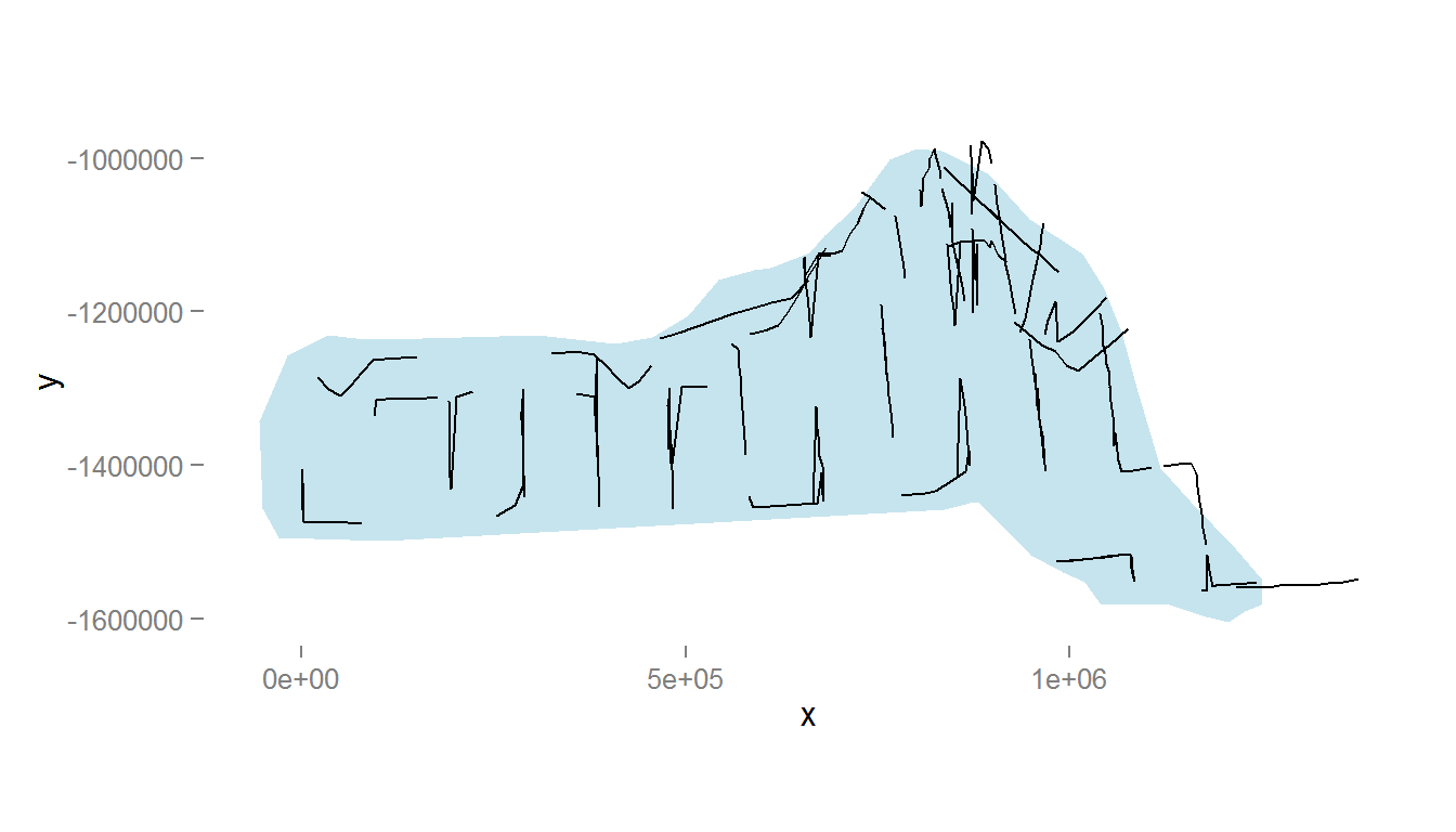
Figure 1: The survey area with transect lines.
Also note because we have projected our prediction grid, the “squares” do not look quite like squares. So for plotting we will use the polygons that we have saved, these polygons (stored in pred.polys) are read from a shapefile created in GIS, the object itself is of class SpatialPolygons from the sp package. This plotting method makes plotting take a little longer, but avoids gaps and overplotting. Figure 2 compares using latitude/longitude with a projection.
par(mfrow=c(1,2))

# put pred.polys into lat/long
pred_latlong <- spTransform(pred.polys,CRSobj=CRS("+proj=longlat +datum=WGS84"))

# plot latlong
plot(pred_latlong, xlab="Longitude", ylab="Latitude")
axis(1); axis(2); box()

# plot as projected
plot(pred.polys, xlab="Northing", ylab="Easting")
axis(1); axis(2); box()
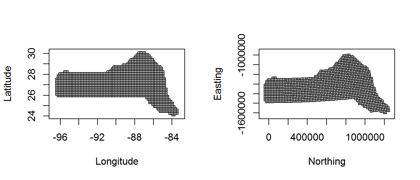
Figure 2: Comparison between unprojected latitude and longitude (left) and the prediction grid projected using the North American Lambert Conformal Conic projection (right)
Tips on plotting polygons are available from the ggplot2 wiki.
Here we define a convenience function to generate an appropriate data structure for ggplot2 to plot:
# given the argument fill (the covariate vector to use as the fill) and a name,
# return a geom_polygon object
# fill must be in the same order as the polygon data
library(plyr)
grid_plot_obj <- function(fill, name, sp){

  # what was the data supplied?
  names(fill) <- NULL
  row.names(fill) <- NULL
  data <- data.frame(fill)
  names(data) <- name

  spdf <- SpatialPolygonsDataFrame(sp, data)
  spdf@data$id <- rownames(spdf@data)
  spdf.points <- fortify(spdf, region="id")
  spdf.df <- join(spdf.points, spdf@data, by="id")

  # seems to store the x/y even when projected as labelled as "long" and "lat"
  spdf.df$x <- spdf.df$long
  spdf.df$y <- spdf.df$lat

  geom_polygon(aes_string(x="x",y="y",fill=name, group="group"), data=spdf.df)
}
4 Exploratory data analysis
4.1 Distance data
The top panels of Figure 3, below, show histograms of observed distances and cluster size, while the bottom panels show the relationship between observed distance and observed cluster size, and the relationship between observed distance and Beaufort sea state. The plots show that there is some relationship between cluster size and observed distance (fewer smaller clusters seem to be seen at larger distances).
The following code generates Figure 3:
par(mfrow=c(2,2))

# histograms
hist(distdata$distance,main="",xlab="Distance (m)")
hist(distdata$size,main="",xlab="Cluster size")

# plots of distance vs. cluster size
plot(distdata$distance, distdata$size, main="", xlab="Distance (m)",
     ylab="Group size", pch=19, cex=0.5, col=gray(0.7))

# lm fit
l.dat <- data.frame(distance=seq(0,8000,len=1000))
lo <- lm(size~distance, data=distdata)
lines(l.dat$distance, as.vector(predict(lo,l.dat)))

plot(distdata$distance,distdata$beaufort, main="", xlab="Distance (m)",
     ylab="Beaufort sea state", pch=19, cex=0.5, col=gray(0.7))
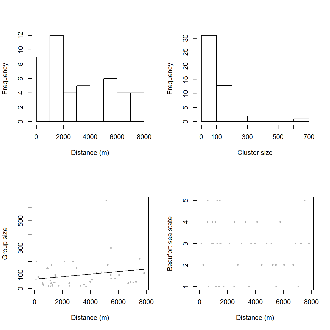
Figure 3: Exploratory plot of the distance sampling data. Top row, left to right: histograms of distance and cluster size; bottom row: plot of distance against cluster size and plot of distances against Beaufort sea state.
4.2 Spatial data
Looking only at the spatial data without thinking about sighting distances, we can plot the observed group sizes in space (Figure 4, below). Circle size indicates the size of the group in the observation. There are rather large areas with no observations, which might cause our variance estimates for abundance to be rather large. Figure 4 also shows the depth data which we will use depth later as an explanatory covariate in our spatial model.
The following code generates Figure 4:
p <- ggplot() + grid_plot_obj(preddata$depth, "Depth", pred.polys) + coord_equal()
p <- p + labs(fill="Depth",x="x",y="y",size="Group size")
p <- p + geom_line(aes(x, y, group=Transect.Label), data=segdata)
p <- p + geom_point(aes(x, y, size=size), data=distdata, colour="red",alpha=I(0.7))
p <- p + gg.opts
print(p)
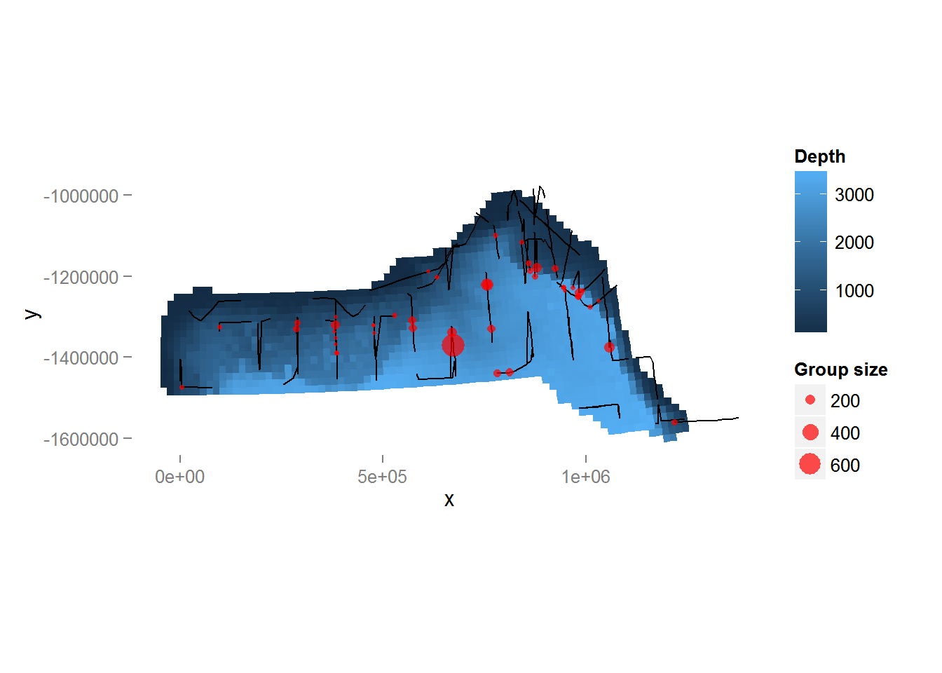
Figure 4: Plot of depth values over the survey area with transects and observations overlaid. Point size is proportional to the group size for each observation.
5 Estimating the detection function
We use the ds function in the package Distance to fit the detection function. (The Distance package is intended to make standard distance sampling in R relatively straightforward. For a more flexible but more complex alternative, see the function ddf in the mrds library.)
First, loading the Distance library:
library(Distance)We can then fit a detection function with hazard-rate key with no adjustment terms:
detfc.hr.null<-ds(distdata, max(distdata$distance), key="hr", adjustment=NULL)Fitting hazard-rate key function
Key only models do not require monotonicity contraints. Not constraining model for monotonicity.
AIC= 841.253
No survey area information supplied, only estimating detection function.Calling summary gives us information about parameter estimates, probability of detection, AIC, etc:
summary(detfc.hr.null)
Summary for distance analysis
Number of observations :  47
Distance range         :  0  -  7847.467

Model : Hazard-rate key function
AIC   : 841.2528

Detection function parameters
Scale Coefficients:
            estimate        se
(Intercept)  7.98244 0.9532549

Shape parameters:
            estimate        se
(Intercept)        0 0.7833683

                      Estimate         SE        CV
Average p            0.5912252  0.2224366 0.3762299
N in covered region 79.4959326 30.8139054 0.3876161
The following code generates a plot of the fitted detection function (Figure 5) and quantile-quantile plot:
par(mfrow=c(1,2))
plot(detfc.hr.null, showpoints=FALSE, pl.den=0, lwd=2)
ddf.gof(detfc.hr.null$ddf)
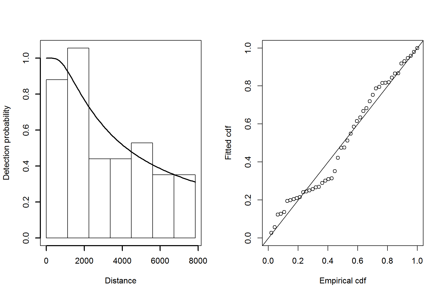
Figure 5: Plot of the fitted detection function (left) and goodness of fit plot (right) for the hazard-rate model.
The quantile-quantile plot show relatively good fit for the hazard-rate detection function.
5.1 Adding covariates to the detection function
It is common to include covariates in the detection function (so-called Multiple Covariate Distance Sampling or MCDS). In this dataset there are two covariates that were collected on each individual: Beaufort sea state and size. For brevity we fit only a hazard-rate detection functions with the sea state included as a factor covariate as follows:
detfc.hr.beau<-ds(distdata, max(distdata$distance), formula=~as.factor(beaufort),
                  key="hr", adjustment=NULL)
Again looking at the summary,
summary(detfc.hr.beau)
Summary for distance analysis
Number of observations :  47
Distance range         :  0  -  7847.467

Model : Hazard-rate key function
AIC   : 843.7117

Detection function parameters
Scale Coefficients:
                        estimate        se
(Intercept)           7.66318287  1.076837
as.factor(beaufort)2  2.27962947 17.363350
as.factor(beaufort)3  0.28605741  1.019006
as.factor(beaufort)4  0.07172295  1.223285
as.factor(beaufort)5 -0.36397645  1.537274

Shape parameters:
             estimate        se
(Intercept) 0.3004333 0.5179851

                      Estimate        SE        CV
Average p            0.5421255  0.175056 0.3229068
N in covered region 86.6957960 29.413228 0.3392694
Here the detection function with covariates does not give a lower AIC than the model without covariates (843.71 vs. 841.25 for the hazard-rate model without covariates). Looking back to the bottom-right panel of Figure 3, we can see there is not a discernible pattern in the plot of Beaufort vs distance.
For brevity, detection function model selection has been omitted here. In practise we would fit many different forms for the detection function (and select a model based on goodness of fit testing and AIC).
6 Fitting a DSM
Before fitting a dsm model, the data must be segmented; this consists of chopping up the transects and attributing counts to each of the segments. As mentioned above, these data have already been segmented.
6.1 A simple model
We begin with a very simple model. We assume that the number of individuals in each segment are quasi-Poisson distributed and that they are a smooth function of their spatial coordinates (note that the formula is exactly as one would specify to gam in mgcv). By setting group=TRUE, the abundance of clusters/groups rather than individuals can be estimated (though we ignore this here). Note we set method="REML" to ensure that smooth terms are estimated reliably.
Running the model:
dsm.xy <- dsm(count~s(x,y), detfc.hr.null, segdata, obsdata, method="REML")We can then obtain a summary of the fitted model:
summary(dsm.xy)
Family: quasipoisson
Link function: log

Formula:
count ~ s(x, y) + offset(off.set)

Parametric coefficients:
            Estimate Std. Error t value Pr(>|t|)
(Intercept)   -18.20       0.53  -34.34   <2e-16 ***
---
Signif. codes:  0 '***' 0.001 '**' 0.01 '*' 0.05 '.' 0.1 ' ' 1

Approximate significance of smooth terms:
        edf Ref.df     F  p-value
s(x,y) 24.8  27.49 2.354 0.000714 ***
---
Signif. codes:  0 '***' 0.001 '**' 0.01 '*' 0.05 '.' 0.1 ' ' 1

R-sq.(adj) =  0.121   Deviance explained = 43.4%
-REML = 936.04  Scale est. = 94.367    n = 387
The exact interpretation of the model summary results can be found in Wood (2006); here we can see various information about the smooth components fitted and general model statistics.
We can use the deviance explained to compare between models2.
We can also get a rough idea of what the smooth of space looks like using vis.gam:
vis.gam(dsm.xy, plot.type="contour", view=c("x","y"), asp=1, type="response", contour.col="black", n.grid=100)
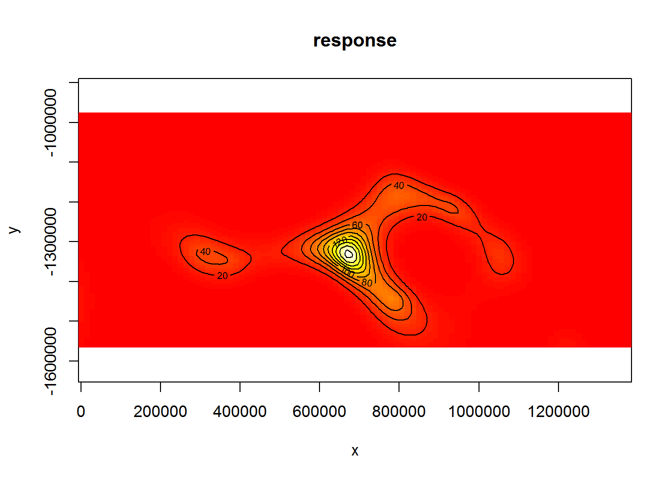
Figure 6: Plot of the spatial smooth in dsm.xy, values are relative abundances. White/yellow indicates high values, red low indicates low values.
The type="response" argument ensures that the plot is on the scale of abundance but the values are relative (as the offsets are set to their median values). This means that the plot is useful to get an idea of the general shape of the smooth but cannot be interpreted directly.
6.2 Adding another environmental covariate to the spatial model
The data set also contains a depth covariate (which we plotted above). We can include in the model very simply:
dsm.xy.depth <- dsm(count~s(x,y,k=10) + s(depth,k=20), detfc.hr.null, segdata, obsdata, method="REML")
summary(dsm.xy.depth)
Family: quasipoisson
Link function: log

Formula:
count ~ s(x, y, k = 10) + s(depth, k = 20) + offset(off.set)

Parametric coefficients:
            Estimate Std. Error t value Pr(>|t|)
(Intercept)  -18.740      1.236  -15.16   <2e-16 ***
---
Signif. codes:  0 '***' 0.001 '**' 0.01 '*' 0.05 '.' 0.1 ' ' 1

Approximate significance of smooth terms:
           edf Ref.df     F p-value
s(x,y)   6.062  7.371 0.923  0.5051
s(depth) 9.443 11.466 1.585  0.0824 .
---
Signif. codes:  0 '***' 0.001 '**' 0.01 '*' 0.05 '.' 0.1 ' ' 1

R-sq.(adj) =  0.0909   Deviance explained = 34.3%
-REML = 939.52  Scale est. = 124.9     n = 387
Here we see a drop in deviance explained, so perhaps this model is not as useful as the first. We discuss setting the k parameter in the more complete document on the Github site.
Setting select=TRUE here (as an argument to gam) would impose extra shrinkage terms on each smooth in the model (allowing smooth terms to be removed from the model during fitting; see ?gam for more information). This is not particularly useful here, so we do not include it. However when there are many environmental predictors is in the model this can be a good way (along with looking at pp-values) to perform term selection.
Simply calling plot on the model object allows us to look at the relationship between depth and the linear predictor (shown in Figure 7):
plot(dsm.xy.depth, select=2)
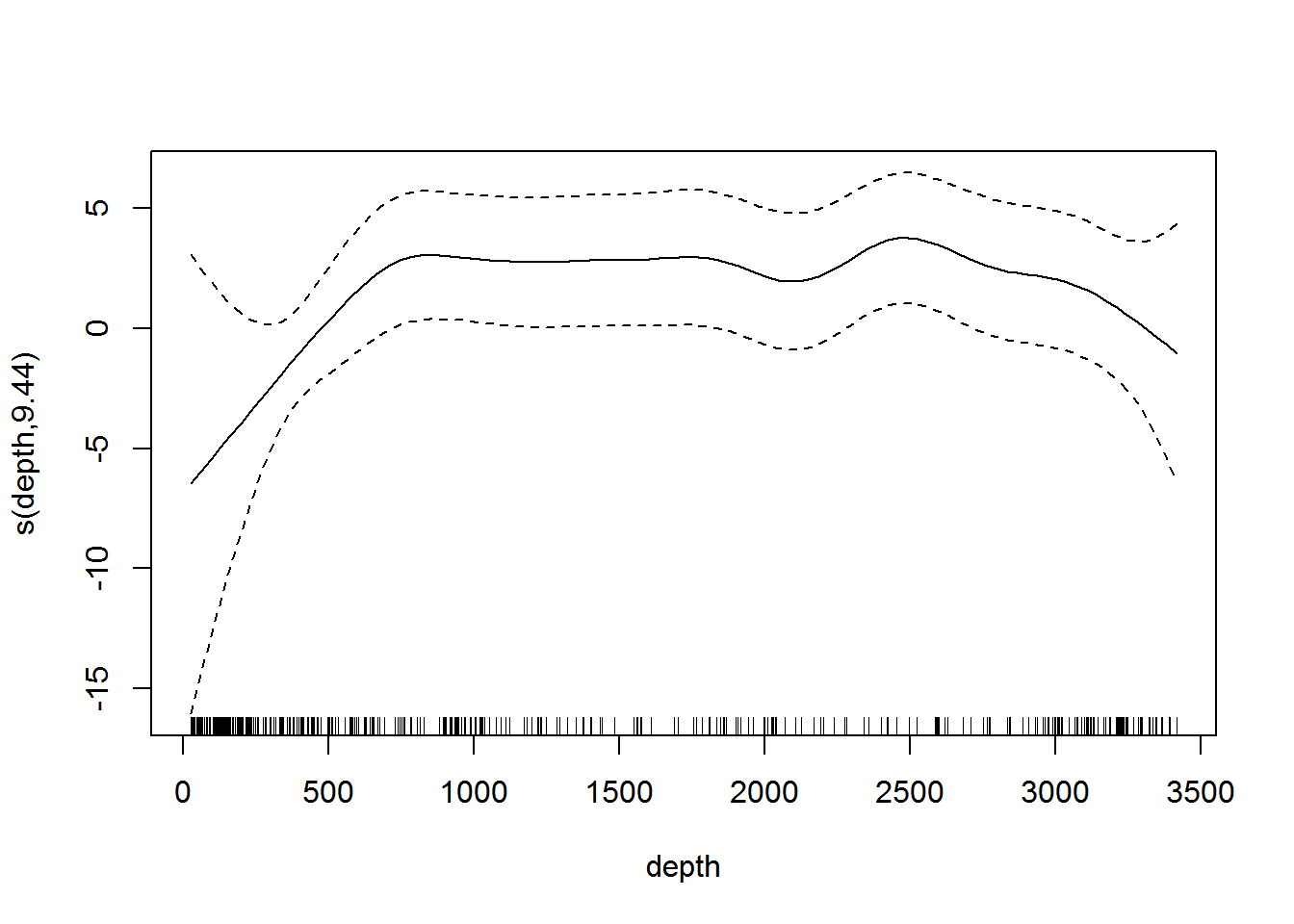
Figure 7: Plot of the smooth of depth in dsm.xy.depth. This “hockey stick” shaped smooth indicates that there is little predictive value in depth beyond 500m.
Omitting the argument select in the call to plot will plot each of the smooth terms, one at a time.
7 Model selection
Assuming that models have “passed” the checks in gam.check, rqgam.check and are sufficiently flexible, we may be left with a choice of which model is “best”. There are several methods for choosing the best model – AIC, REML/GCV scores, deviance explained, full cross-validation with test data and so on.
Though this document is not intended to be a full analysis of the pantropical dolphin data, we can create a table to compare the various models that have been fitted so far in terms of their abundance estimates and associated uncertainties.
# make a data.frame to print out
mod_results <- data.frame("Model name" = c("`dsm.xy`", "`dsm.xy.depth`"),
                          "Description" = c("Bivariate smooth of location, quasipoisson",
                                            "Bivariate smooth of location, smooth of depth, quasipoisson"),
                          "Deviance explained" = c(unlist(lapply(list(dsm.xy, dsm.xy.depth),
                 function(x){paste0(round(summary(x)$dev.expl*100,2),"%")}))))
We can then use the resulting data.frame to build a table of results using the kable function:
kable(mod_results, col.names=c("Model name", "Description", "Deviance explained"))| Model name | Description | Deviance explained |
|---|---|---|
dsm.xy |
Bivariate smooth of location, quasipoisson | 43.38% |
dsm.xy.depth |
Bivariate smooth of location, smooth of depth, quasipoisson | 34.32% |
8 Abundance estimation
Once a model has been checked and selected, we can make predictions over the grid and calculate abundance. The offset is stored in the area column3.
dsm.xy.pred <- predict(dsm.xy, preddata, preddata$area)Figure 8 shows a map of the predicted abundance. We use the grid_plot_obj helper function to assign the predictions to grid cells (polygons).
p <- ggplot() + grid_plot_obj(dsm.xy.pred, "Abundance", pred.polys) + coord_equal() +gg.opts
p <- p + geom_path(aes(x=x, y=y),data=survey.area)
p <- p + labs(fill="Abundance")
print(p)
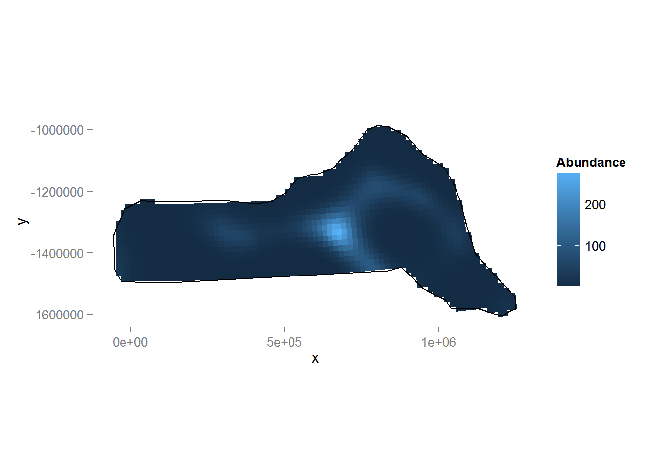
Figure 8: Predicted density surface for dsm.xy.
We can calculate abundance over the survey area by simply summing these predictions:
sum(dsm.xy.pred)[1] 28462.22We can compare this with a plot of the predictions from this dsm.xy.depth (Figure 9, code below).
dsm.xy.depth.pred <- predict(dsm.xy.depth, preddata, preddata$area)
p <- ggplot() + grid_plot_obj(dsm.xy.depth.pred, "Abundance", pred.polys) + coord_equal() +gg.opts
p <- p + geom_path(aes(x=x, y=y), data=survey.area)
p <- p + labs(fill="Abundance")
print(p)
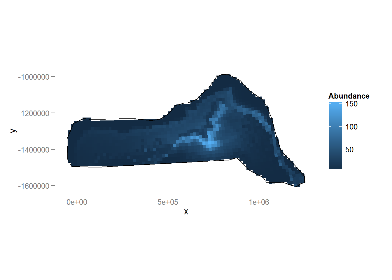
Figure 9: Predicted density surface for dsm.xy.depth.
We can see the inclusion of depth into the model has had a noticeable effect on the distribution (note the difference in legend scale between the two plots). We can again also look at the total abundance:
sum(dsm.xy.depth.pred)[1] 27084.54Here we see that there is little change in estimated abundance, so in terms of abundance alone there is little between the two models. We will examine uncertainty in abundance estimates.
9 Variance estimation
Obviously point estimates of abundance are important, but we should also calculate uncertainty around these abundance estimates. Fortunately dsm provides functions to perform these calculations and display the resulting uncertainty estimates.
We can use the approach of Williams et al (2011), which allows us to incorporate both detection function uncertainty and spatial model (GAM) uncertainty in our estimates of the variance.
The dsm.var.prop function will estimate the variance of the abundance for each element in the list provided in pred.data. In our case we wish to obtain an abundance for each of the prediction cells, so we use split to chop our data set into list elements to give to dsm.var.prop.
preddata.varprop <- split(preddata, 1:nrow(preddata))
dsm.xy.varprop <- dsm.var.prop(dsm.xy, pred.data=preddata.varprop,
                               off.set=preddata$area)
Calling summary will give some information about uncertainty estimation:
summary(dsm.xy.varprop)Summary of uncertainty in a density surface model calculated
by variance propagation.
Quantiles of differences between fitted model and variance model
Min. 1st Qu. Median Mean 3rd Qu. Max.
-1.492e-13 0.000e+00 8.438e-15 3.699e-14 5.596e-14 5.542e-13
Approximate asymptotic confidence interval:
5% Mean 95%
14160.42 28462.22 57208.62
(Using delta method)
Point estimate : 28462.22
Standard error : 10468.09
Coefficient of variation : 0.3678 The section of output labelled Quantiles of differences between fitted model and variance model can be used to check the variance model does not have major problems (values much less than 1 indicate no issues).
This method will only work when there are either no covariates in the detection function or when those that are there only vary at the scale of segments (e.g. the Beaufort sea state varies per segment so would be fine to include, but the observer may vary within transect for multiple observer surveys, so would not be appropriate to include).
Note that for models where there are covariates at the individual level we cannot calculate the variance via the variance propagation method (dsm.var.prop) of Williams et al (2011). Instead we can use a GAM uncertainty estimation and combine it with the detection function uncertainty via the delta method (dsm.var.gam) which simply sums the squared coefficients of variation to get a total coefficient of variation (and therefore assumes that the detection process and spatial process are independent). There are no restrictions on the form of the detection function when using dsm.var.gam.
We can also make a plot of the CVs using the following code (Figure 10).
p <- ggplot() + grid_plot_obj(sqrt(dsm.xy.varprop$pred.var)/unlist(dsm.xy.varprop$pred),
                              "CV", pred.polys) + coord_equal() +gg.opts
p <- p + geom_path(aes(x=x, y=y),data=survey.area)
p <- p + geom_line(aes(x, y, group=Transect.Label), data=segdata)
print(p)
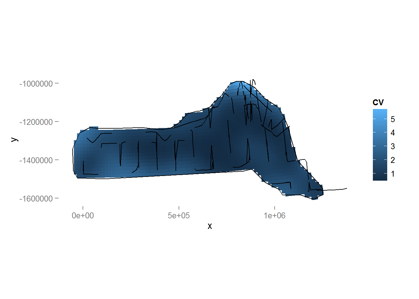
Figure 10: Plot of the coefficient of variation for the study area with transect lines and observations overlaid. Note the increase in CV away from the transect lines.
We can revisit the model that included both depth and location smooths and observe that the coefficient of variation for that model is larger than that of the model with only the location smooth.
dsm.xy.depth.varprop <- dsm.var.prop(dsm.xy.depth, pred.data=preddata.varprop, off.set=preddata$area)
summary(dsm.xy.depth.varprop)
Summary of uncertainty in a density surface model calculated
by variance propagation.
Quantiles of differences between fitted model and variance model
Min. 1st Qu. Median Mean 3rd Qu. Max.
-2.132e-13 -4.774e-15 -2.637e-16 2.680e-14 5.107e-15 9.095e-13
Approximate asymptotic confidence interval:
5% Mean 95%
12359.48 27084.54 59353.00
(Using delta method)
Point estimate : 27084.54
Standard error : 11290.37
Coefficient of variation : 0.4169 10 Conclusions
This document has outlined an analysis of spatially-explicit distance sampling data using the dsm package. Note that there are many possible models that can be fitted using dsm and that the aim here was to show just a few of the options. Results from the models can be rather different, so care must be taken in performing model selection, discrimination and criticism.
11 Software
Distanceis available at http://github.com/DistanceDevelopment/Distance as well as on CRAN.dsmis available at http://github.com/DistanceDevelopment/dsm, as well as on CRAN.
12 References
- Bivand, RS, E Pebesma, and V Gomez-Rubio (2013). Applied Spatial Data Analysis with R, Springer Science & Business Media.
- Hedley, SL and Buckland, ST (2004). Spatial models for line transect sampling. Journal of Agricultural, Biological, and Environmental Statistics, 9, 181-199.
- Miller, DL, ML Burt, EA Rexstad, and L Thomas (2013). Spatial models for distance sampling data: recent developments and future directions. Methods in Ecology and Evolution 4(11): 1001-1010.
- Pinheiro, JC, and Bates, DM (2000). Mixed-effects models in S and S-PLUS, Springer.
- Williams, R, Hedley, SL, Branch, TA, Bravington, MV, Zerbini, AN and Findlay, KP (2011). Chilean blue whales as a case study to illustrate methods to estimate abundance and evaluate conservation status of rare species. Conservation Biology, 25, 526-535.
- Wood, SN (2006). Generalized Additive Models: an introduction with R. Chapman and Hall/CRC Press.
- These operations can be performed in R using the
spandrgeospackages. It may, however, be easier to perform these operations in GIS such as ArcGIS – in which case the MGET Toolbox may be useful.↩ - Note though that the adjusted R2R2 for the model is defined as the proportion of variance explained but the “original” variance used for comparison doesn’t include the offset (the area (or effective of the segments). It is therefore not recommended for one to directly interpret the R2R2 value (see the
summary.gammanual page for further details).↩ - An earlier version of this vignette incorrectly stated that the areas of the prediction cells were 444km22. This has been corrected. Thanks to Phil Bouchet for pointing this out.↩